Define Resource Type In Map
Now that the tutorial_resource_wood has been created, we need to define it to the tutorial_map scene to make it usable in that map.
1. Resource Manager
The component we want to modify first is called the Resource Manager which is attached to the object on the following path in the hierarchy: GameManager -> Essential -> ResourceExtension. Go ahead and select it.
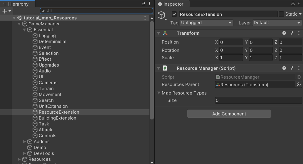
Now to modify its properties:
- Resources Parent: In order to avoid slow loading times when the scene starts, it is advisable to have all the default placed resources under one common parent objects where its child objects will iterated to look for Resource entities. We have not got to create a resource entity until now but we will in the next section. Keep this field assigned to the default object it is assigned too, which should be an empty object for now.
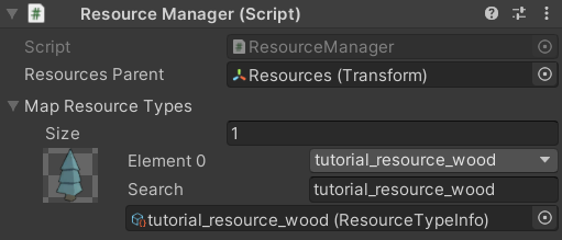
- Map Resource Types: This array defines all of the Resource Types that can be used in the map. We want to add the tutorial_resource_wood to this list.
2. Configure Resources UI
Now we want to go through the configurations of the UI elements that represent the resources in the map scene. Make sure you are in the tutorial_map scene.
2.1 Essential UI Manager Components
First, in the hierarchy navigate to GameManager -> Essential -> UI and you will see two components attached on that game object.
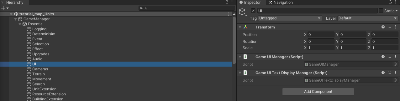
The Game UI Manager and Game UI Text Display Manager are two components which have no fields that can be assigned through the inspector. They can however be extended through code to provide more customization for the UI.
2.2 Resource Panel UI Handler
All UI manager components, except the aforementioned two, are optional and are not required for the game run as they rely on public general events fired by other RTS Engine components to update the UI elements accordingly. These optional UI components that manage the UI can be found in the hierarchy under GameManager -> Addons -> UI:
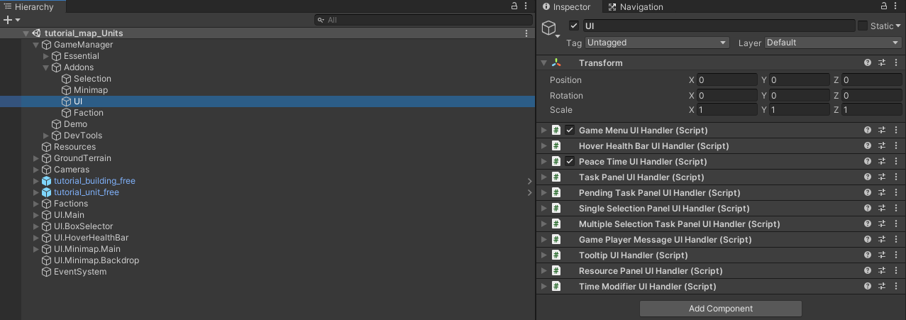
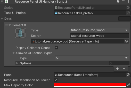
The Resource Panel UI Handler is the one responsible for representing resources and their count in the UI. Expand it and let's explore its fields:
Task UI Prefab: For each resource type that is represented in the UI, a UI object is cloned from the prefab assigned in this field. Click on that prefab and open it (you can also find it within the path: RTS Engine -> Core -> Prefabs -> UI) and let's explore its structure:
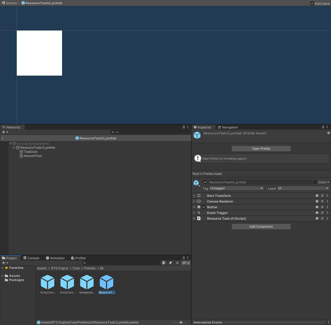 In the prefab's parent object, we have the following components:
- UI Image component: Responsible for displaying a backdrop for the resource icon.
- Resource Task UI component: Required component responsible for handling the representation of a resource type in the UI. It has the following fields:
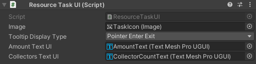
- Image: Accepts a UI element that is a child object of the prefab and that has a UI Image component attached to it to be used for displaying the resource's icon.
- Tooltip Display Type: How to display the tooltip? Using pointer enter and exit or pointer up and down. First option is suitable for desktop while the second would be more suitable for mobile platforms.
- Amount Text UI: Accepts a UI element that is a child object of the prefab and that has a UI Text component attached to it to be used for displaying the resource's amount and capacity for the local player faction.
- Collectors Text UI: Accepts a UI element that is a child object of the prefab and that has a UI Text component attached to it to be used for displaying the resource's collectors count for the local player faction.
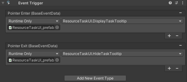
- UI Button component: Required to allow the UI object to be clickable. In the On Click() event, make sure that it invokes Click on the Resource Task UI attached to the same object.
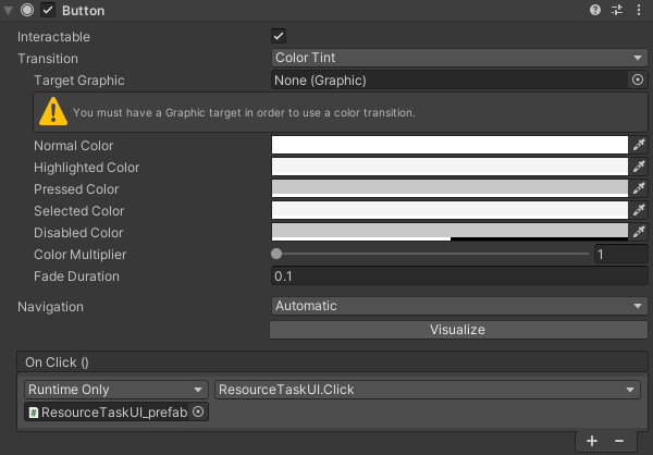
- Event Trigger component: Includes events that allow the resource UI object to have a tooltip enabled when the player's mouse is over it. Make sure it has a Pointer Enter event that invokes DisplayTaskTooltip and a Pointer Exit event that invokes HideTaskTooltip on the Resource Task UI attached to the same object.
If you want a different layout for the resource UI object prefab, then it is recommended that you create a clone from this prefab to use in your own scenes.
Data: This array fields allows to input the resources that you want to display in the UI. Not all resources have to be displayed in the UI so you can have less resource types assigned here than in the Resource Manager component. In this case, we want to display the amount of the tutorial_resource_wood resource type so we need to add one element to this field and assign the resource type. For each resource type, you can decide whether to display the current count of collectors using the Display Collector Count field as well as filter showing the resource types in the UI depending on the faction type of the local player by modifying the Allowed UI Faction Types sub-field. In our case, we want to show the tutorial_resource_wood for all faction types so we keep the Allowed UI Faction Types field assigned to All.
- Panel: UI object that has a Grid Layout Group component attached. This is the parent object of all the resource tasks that will be created. We will leave the default panel assigned to this field, which is the one on the top left corner of the main UI canvas.
- Resource Description As Tooltip: When this field is enabled, the resource's description assigned in the Resource Type asset is displayed when the local player hovers their mouse over the resource in the UI.
- Max Capacity Color: When a capacity resource (a resource that has a capped amount) reaches the maximum capacity, its icon in the UI will be colored by the color assigned in this field. In this case, we want to inform the player that a resource reaches its max capacity by coloring its icon in red.
3. Testing and Using Resource
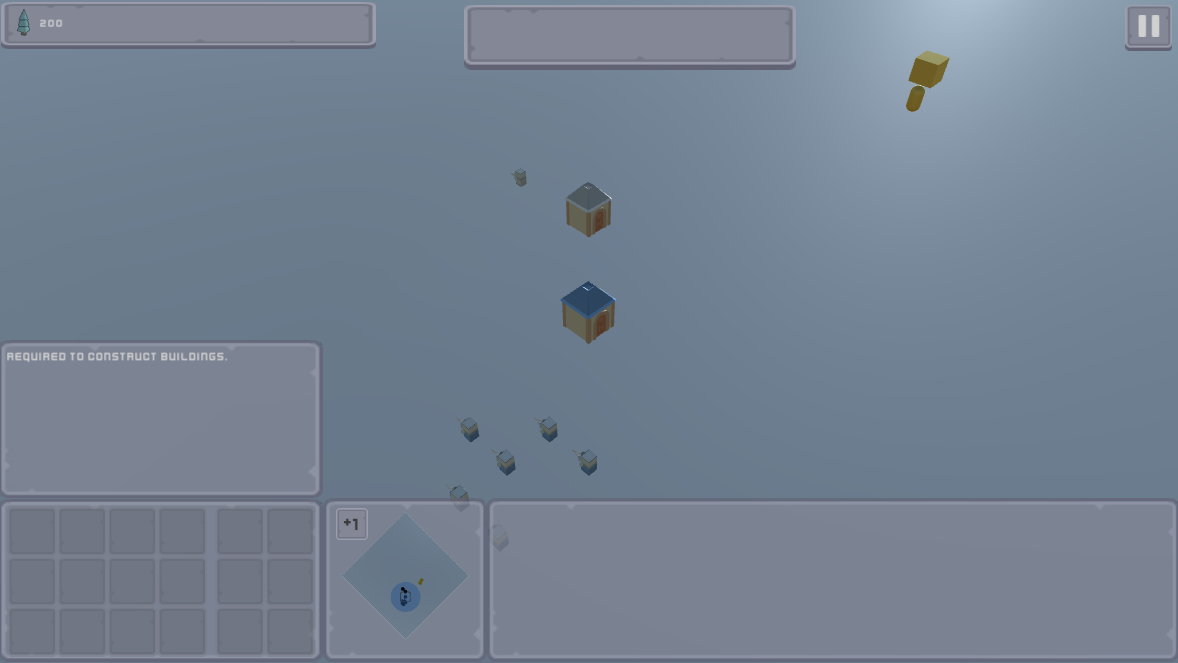
Now that the resource is defined in the tutorial_map scene, start the scene and you will be able to see the tutorial_resource_wood icon drawn in the top left panel on the screen along with the default starting amount of the resource. When hovering the mouse over it, a tooltip will appear with the description of the resource type.
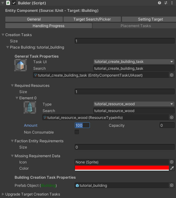
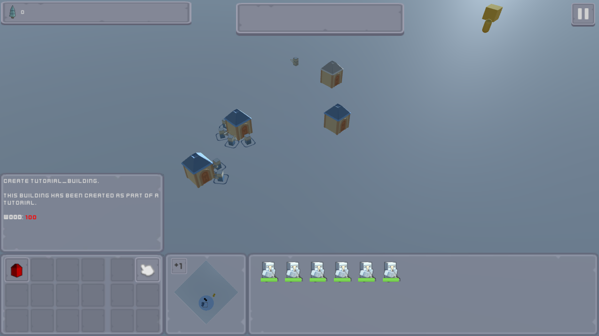
Now stop the game and open the tutorial_unit prefab and navigate to its unit_components child object and you'd find the Builder component that we setup in a previous tutorial. Open the Placement Tasks tab and in the first element of Creation Tasks where we defined the placement task for the tutorial_building, add the tutorial_resource_wood to the Required Resources field and assign the amount to 100. This means that the tutorial_building will now cost 100 wood to place.
Now start the tutorial_scene, select the pre-spawned units and hover over the tutorial_building placement task. You can see that the tooltip now displays the required resources.
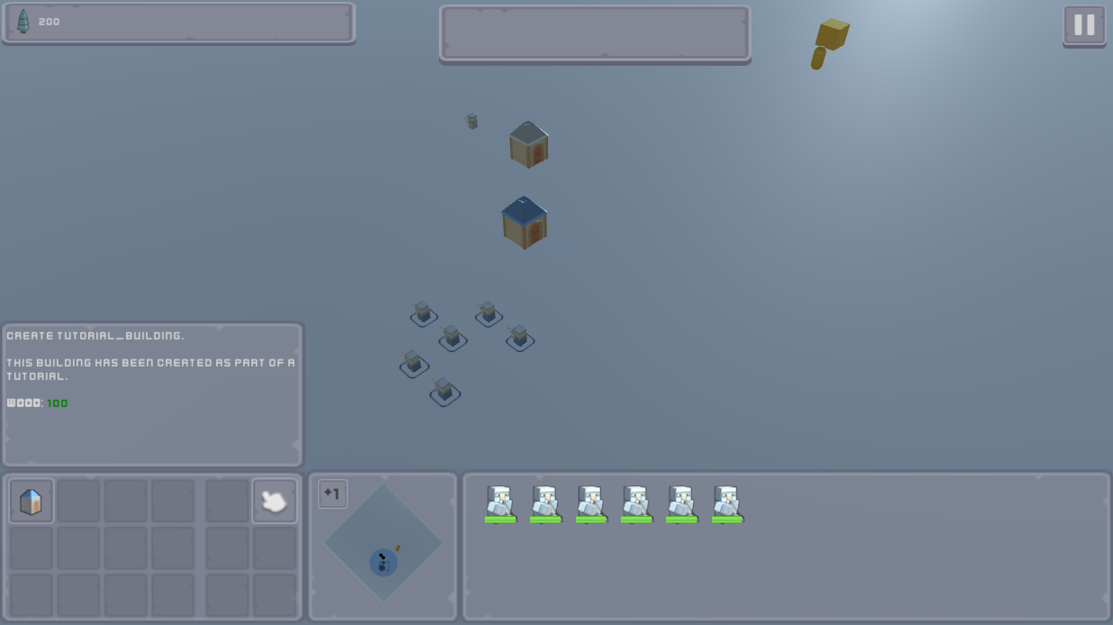
Go ahead and place two instances of the tutorial_building which would cost 200 units of the wood resource. At this point, the resource UI would display an amount of zero and the placement task will be locked due to insufficient resources. This means that the resource setup is now working as expected.
In the next sections, we will explore creating collectable resource entities and allowing units to collect them.
Download Files
You can download the results of this tutorial here.